


How Colors in Art Affect Your Mood and Daily Energy
How Colors in Art Affect Your Mood and Daily Energy
This is the effect of color in art, silent, psychological, emotional, and almost like therapy. Colors aren't just a thought or visual decision - they are frequencies with emotional content that can shift thinking, behavior, and every day energy that is with us. Artists explored, researched, and expressed emotion through pigment long before psychology had formally studied color. If anything, our lifestyles today have showed us just how much our physical surroundings and visual stimuli can impact our mental and emotional state.
We shift from color just being for aesthetics to it being emotional architecture, even though most of us do not realize it is. It answers the invisible language game between your brain and what your eyes are seeing while tripping emotional buttons you didn't even know existed. For creatives, designers, therapists, and homeowners, color decisions are now more purposeful than they have ever been.
As formats evolve from wall murals to custom textile art pieces, colors are no longer something to paint, they're an experience being created.
Why Color Is More Important Than You Think
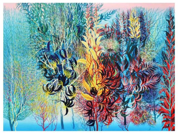
Color paints emotional landscapes. The gentle pastel tones or heavy rich hues build excitement or confidence and energy (warm tones, yellow/orange/red), calmness, thoughtfulness, and clarity (cool tones-associated shades of green/blue/violet), and safety, luxury, and grounding (neutral tones-beige/charcoal/cream).
When art enters interior spaces such as homes, studios, offices, spas, learning rooms - the art becomes part of your lifestyle design rather than an art object, or decorative piece. The choices you hang on your wall become your daily emotional updates, mood filters, or an extension of your personality.
Even illustrators, conceptual artists, and creators who favor the hand-woven stroke or cue in emotional coding simply through their color palettes. Experimenting with stitched, eco-dyed textile art drawings, or layered color palettes each whispering introspection vs. vibrancy depending on the narrative. Each invites viewers into a psychological space, existing in the meaning without a single word.
The Emotional Color Code
Here’s a breakdown of how one color themes typically shift energy:
|
Color Family |
Emotional Expression |
Ideal Use |
|---|---|---|
|
Blue & Aqua |
Calm, thoughtful, balanced |
Bedrooms, reading corners |
|
Green & Earthy Tones |
Healing, refreshing, grounding |
Workspaces, spa corners |
|
Yellow & Gold |
Optimism, creativity, joy |
Studios, living rooms |
|
Red & Wine Tones |
Passion, boldness, stimulation |
Art displays, creative labs |
|
Neutrals & Mono |
Minimal, luxury, reflective |
Modern homes, offices |
Many collectors tend to prefer soft, nature-inspired tones that integrate a visual sense of serenity, and create a like-feeling sensory experience akin to the impact of far more detailed nature paintings featuring forest, sunset, or coastal settings.
On the other hand, many bold artistic personalities will find themselves gravitating toward palettes incorporating various experimental forms, dramatic brushstrokes, or emotionally heavy artworks that reflect the progression we see with regard to modern painting styles of painting.
How Color Will Shape Daily Energy & Thinking
Artworks are environmental anchors. When décor is levied utilizing emotional color theory, they serve as lifestyle cues that also resonate with a person’s mood. For example, a person that is highly stressed and works in a tech-heavy world may need deep oceanic or forest tones, but someone who is feeling creatively trapped may need splashes of energetic, radiant color.
Collectors are also steadily exploring unusual formats, cultural pieces, woven canvases, and color-layers within concept-based displays across styles that help shift their environment without overwhelming their senses. This shows that emotional visuals are not limited to walls; they create whole mental ecosystems.
Choosing the Right Artwork to Support Mood
Here are some good guiding questions to get you started with picking your decor:
1. What energy do I want my space to have? Am I looking for calm, inspiration, grounding, dreamy, luxury, or bold?
2. Do these tones of color help affirm my emotional desired needs, or do they contradict them?
3. Will this artwork continue to feel comforting to me long term, or will it give me a short-term fix of trendiness?
4. Am I feeling a memory, a place, a feeling, or a future intention about this artwork?
Remember, artwork does not have to match your furniture—art should match you.
Frequently Asked Questions (FAQs) :
1. Can colors in art really change my mood?
Yes, colors stimulate emotional parts and centers of memory within the brain (especially with stress levels, motivation, and clarity of thought).
2. What color themes or palette colors are best for calmness?
The best calming colors are blue, mint, earthy greens, soft neutrals, or any tones of lavender.
3. How do I pick artwork for workspaces or studios?
Select an uplifting palette or color themes that stimulate motivation and focus—not so that one is soothed in relaxation.
4. Can emotional art be customized?
Yes, emotional art can be customized many ways (palettes or colors, even the surface textures, and the themes of the concepts can all be based on mood intention).
5. Can the different types of paintings lighting affect how colors look?
Definitely—natural, warm, and spotlight lighting can change what the hues look like (perception) at different times of the day.
6. Should I follow trends when purchasing emotionally connected pieces of art?
Not at all. Select pieces that are meaningful to you rather than what is currently trending.
Conclusion
Art is more than an aesthetic, it is an emotional architecture. When colors are chosen with intention, they will silently impact how we feel, each day. Surround yourself around colors that draw you closer to whoever you desire to be.


